Singapore: A Mobile-First Nation
Singapore has one of the highest smartphone penetration rates in the world. Over 90% of the population owns a smartphone, and many Singaporeans access the internet primarily through mobile devices. For businesses, this means mobile-responsive design isn't just nice to have—it's essential.
The Statistics Speak
- 92% of Singaporeans own a smartphone
- Mobile accounts for over 60% of web traffic
- 53% of users abandon sites that take over 3 seconds to load
- Google uses mobile-first indexing for all websites
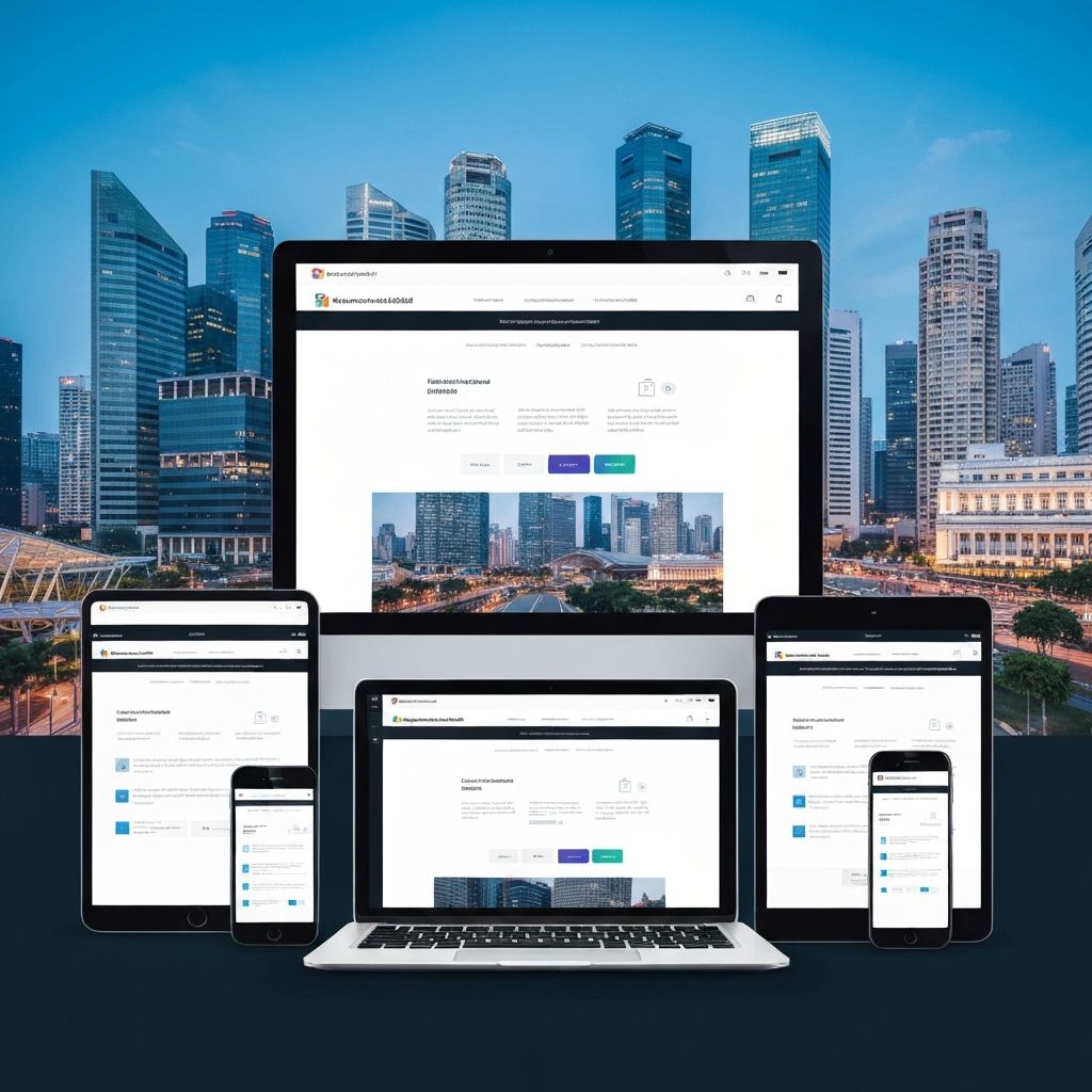
What is Mobile-Responsive Design?
Responsive design means your website automatically adjusts its layout, images, and functionality to fit different screen sizes—from large desktop monitors to tablets to smartphones.
Key Features
- Flexible grid layouts that adapt to screen width
- Images that resize proportionally
- Touch-friendly navigation and buttons
- Readable text without zooming
- Fast loading on mobile networks
Why It Matters for Your Business
1. User Experience
A poor mobile experience frustrates users. If visitors have to pinch and zoom or struggle with tiny buttons, they'll leave—and go to a competitor with a better mobile site.
2. Search Engine Rankings
Google explicitly uses mobile-friendliness as a ranking factor. Non-responsive sites rank lower in search results, meaning fewer potential customers find you.
3. Conversion Rates
Mobile users who have a good experience are more likely to convert—whether that means calling you, filling out a form, or making a purchase.
4. Brand Perception
A professional mobile experience signals that your business is modern and customer-focused. A broken mobile site suggests the opposite.
Testing Your Mobile Experience
- Google's Mobile-Friendly Test tool
- Actually use your site on multiple phones
- Check loading speed on mobile connections
- Test forms and buttons for touch usability
Common Mobile Design Mistakes
- Buttons too small to tap easily
- Text that requires zooming to read
- Horizontal scrolling required
- Pop-ups that cover the screen
- Forms that are difficult to complete on mobile
- Slow loading images and videos
Getting Your Mobile Experience Right
At SgWebDesign, every website we build is 100% mobile responsive. We test across multiple devices to ensure your Singapore customers have a perfect experience, whether they're browsing on their phone during their MRT commute or on their desktop at work.
Is your current website mobile-friendly? Contact us for a free assessment and learn how we can improve your mobile experience with our professional web design services.